
client
Orlando Soria
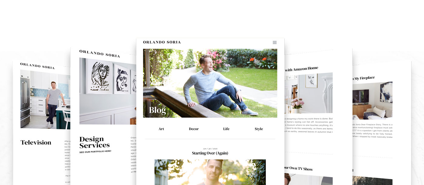
Refresh the website of a design television host that focuses on interior design services, e-commerce, and blogging.
Orlando wanted his website to feel like an art gallery – refined, fresh, and minimalistic – to help offset his colorful design portfolio and artwork. Our mission was to develop a website that would highlight all of his creative talents and attract and attract new clients.
What We Did
• Responsive Web Design
• Web Development
• Web Maintenance
• Web Programming
• WordPress Integration
• Web Development
• Web Maintenance
• Web Programming
• WordPress Integration
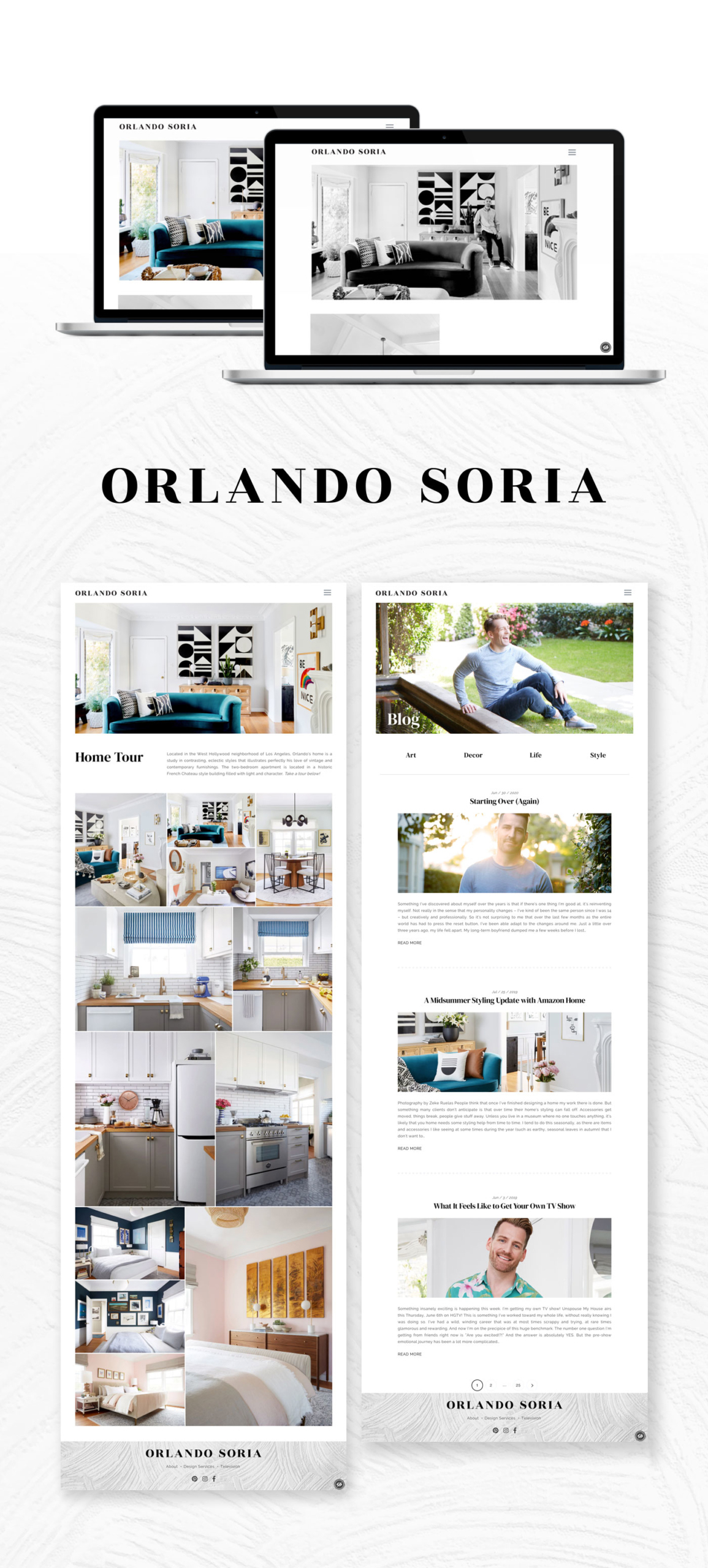
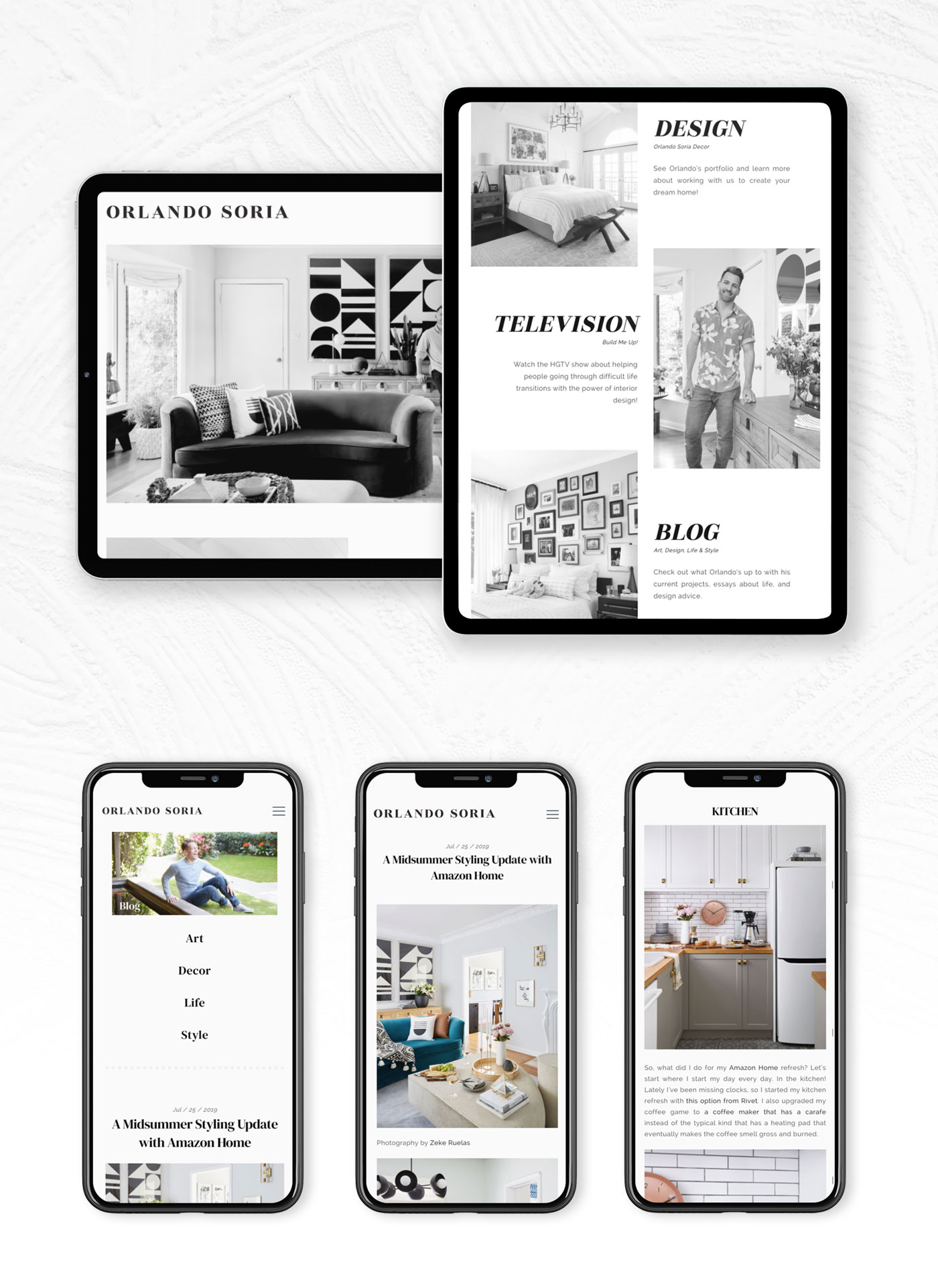
To achieve this art gallery feeling online, we spread out his content with lots of white space to allow the viewer to experience each section without distraction. Additionally, we used a black and white rollover effect on his images to help viewers slow down and interact with his content as they navigate the site.
